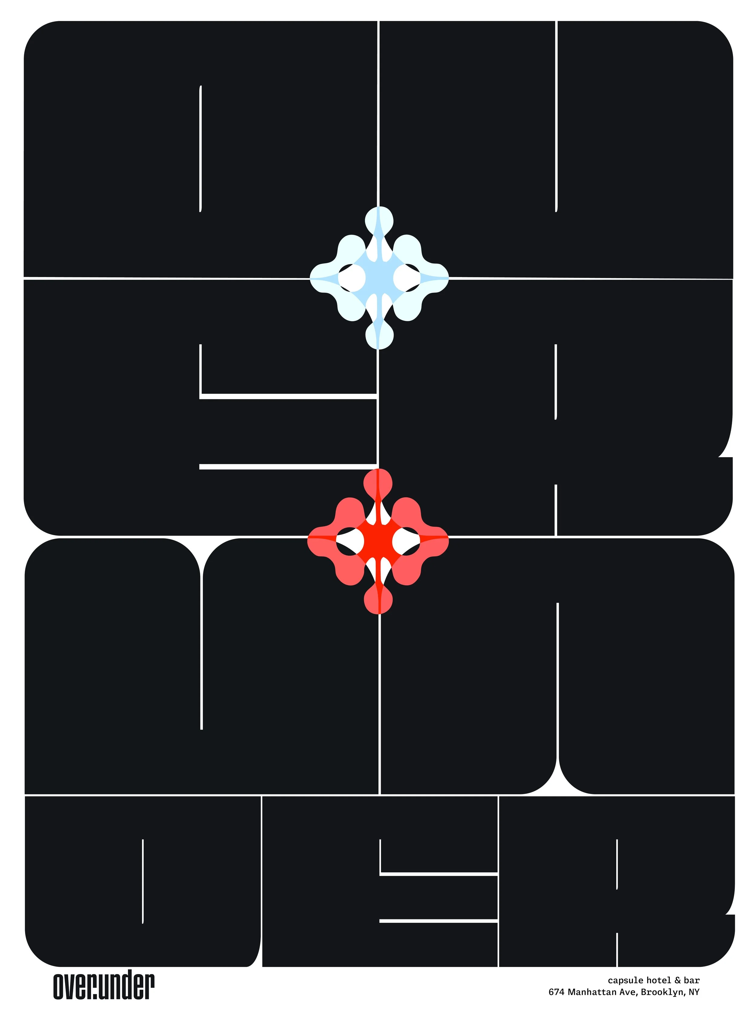
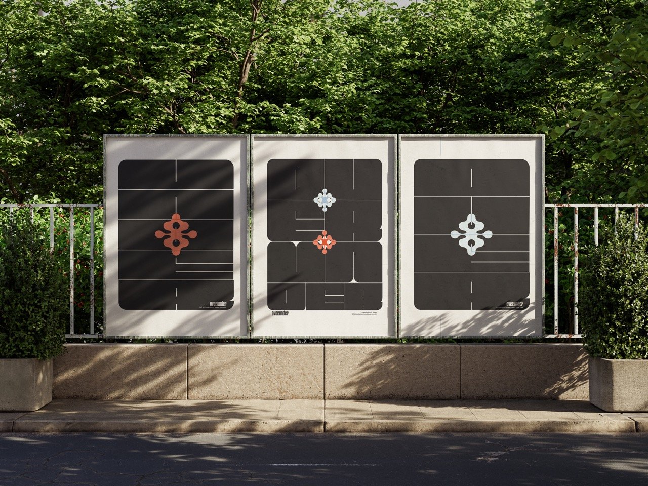
over / under

HOspitality branding | 2024

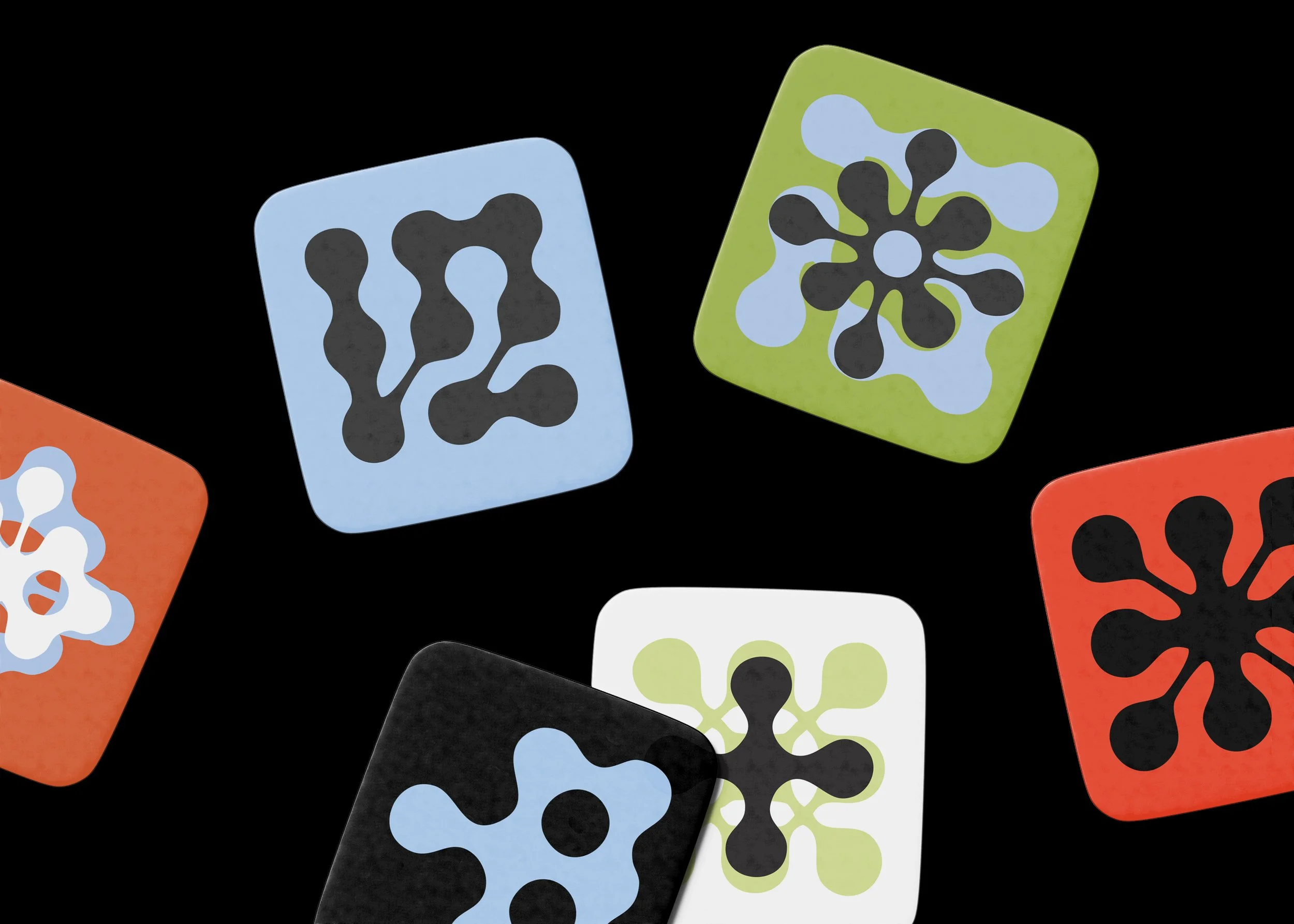
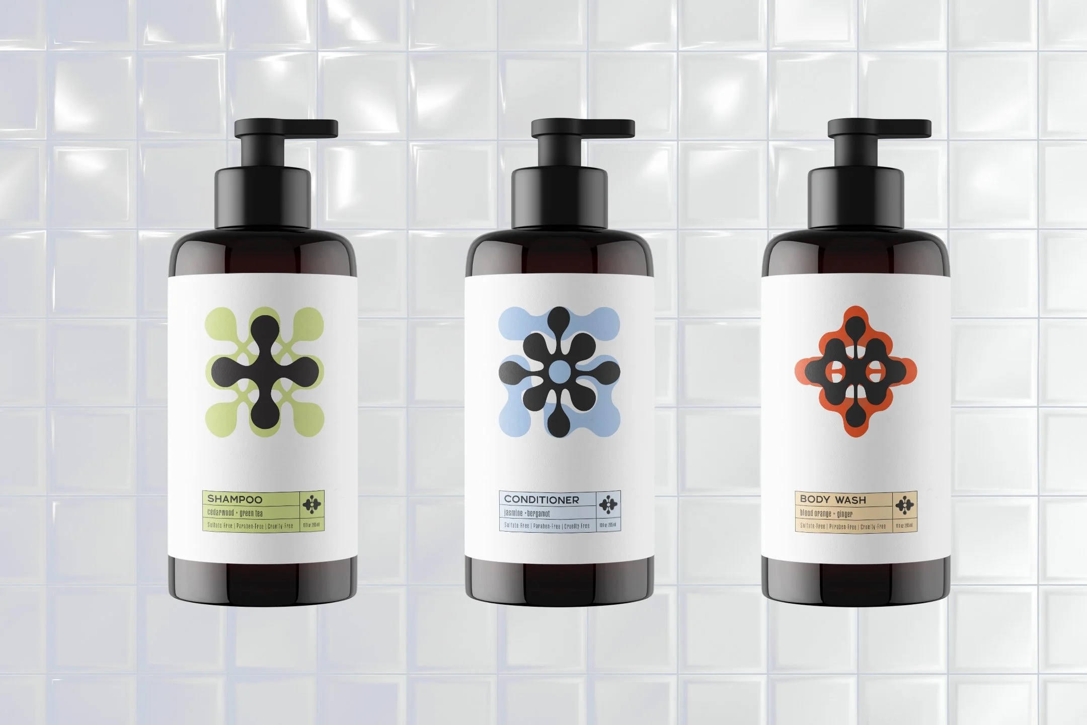
branding, packaging, illustration, copywriting, logo design, typography

Over/Under is about the quiet rhythm of transition—the soft landing after a day spent moving through the chaos of the city. Inspired by the simplicity of Japanese capsule hotels and the intimacy of listening bars, it’s a place where rest and connection exist side by side. Above, the capsules offer a small but intentional space to breathe and reset. Below, the listening bar hums with quiet energy—low lights, the crackle of vinyl, and conversations drifting through the music.

Foreground
Logo

WHEN YOURE DONE WITH YOUR DAY YOU COME HERE TO STAY

over

capsule hotel + resting grounds

Three bottles with pump dispensers against a tiled background, labeled shampoo, conditioner, and body wash.
Capsule hotel interior with rows of compact sleeping pods.
Two elevator doors with a digital floor guide in between, displaying maps and labels for different building levels.

UNDER

LISTENING ROOM + BAR

Abstract design featuring a symmetrical red shape on a black background with white grid lines, labeled 'over/under' at the bottom left and 'listening bar 674 Manhattan Ave, Brooklyn, NY' at the bottom right.
Abstract geometric design with white and light blue shapes on a black background, featuring lines and curves; text "over:under" and address "674 Manhattan Ave, Brooklyn, NY" in the bottom right corner.
Stylized black text on a white background reading "OVER UNDER" with decorative blue and red symmetrical design elements. Bottom text reads "over:under," promoting a capsule hotel and bar at 674 Manhattan Ave, Brooklyn, NY.
Colorful abstract shapes on a black background with patterns resembling amoeba-like designs in squares.
Instagram profile view showing posts and bio for "overunder," a capsule hotel and listening room in Manhattan, with various images of the venue and promotional content.